Archive: Bad Graphs

How Not Commit Chart Crimes
This is an archive copy of a post that originally ran on Substack in September 2023
Humans are visual creatures. It is therefore no wonder that charts and graphs are one of the key ways that we both analyze and communicate information. Prior pieces on sports gambling and the state of the housing market both included these visual aides to support the statements and arguments being made. It is crucial to remember however that no visual aid is created to be neutral. If one is being included, the author or presenter must think it helps their case. This is not to say that graphs are inherently nefarious, but that you should always apply a critical eye, both when creating your own visuals and when evaluating the work of others. There is a fine line between the data “taking you where it leads” and forcing your way to a desired conclusion. These data skills are a crucial part of professional development and companies depend on them for success across the entire org structure. While there is no universally “right” answer on how to present data, it is certainly possible to do it poorly.
Please Don’t Do This
Author’s Note: Business specific examples will follow this section, but I wanted to start with a graphical crime that has been stuck in my brain ever since I saw it.
Back in January of this year, the St. Louis Fed put out a tweet for a blog post discussing global military spending over the prior 30 years. It included the following graph:
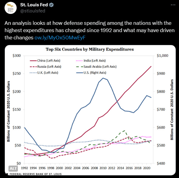
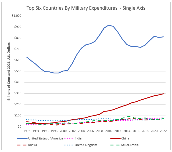
At a first/quick glance, it would seem to show that since the mid-2010’s China has been outspending the United States and every other country shown. Twitter users (myself included) were quick to point out however that the secondary Y-axis makes this chart extremely confusing, if not downright misleading. Using the same underlying data published by the Stockholm International Peace Research Institute (SIPRI), reconstructing the graph with a single Y-axis as shown below looks quite different:
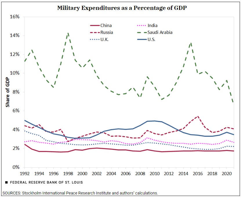
The authors stated that the dual Y-axis was used to make the spending for the other militaries “easier to view.” Given that the U.S. spent anywhere from 1.3 to 3.5 times as much as the other five countries combined during the time period shown, one could argue this was the wrong metric to use to in the first place. The varying size of each country, both in economic and population terms has to be considered to give readers the full picture. It’s clear that the authors did realize this since they included a graph showing military spending as a percentage of GDP in the blog itself (shown below), but it was not the visual they chose to lead with. On this metric, China’s rate of spending has actually remained very consistent and was actually the lowest of the cohort for the time period shown.
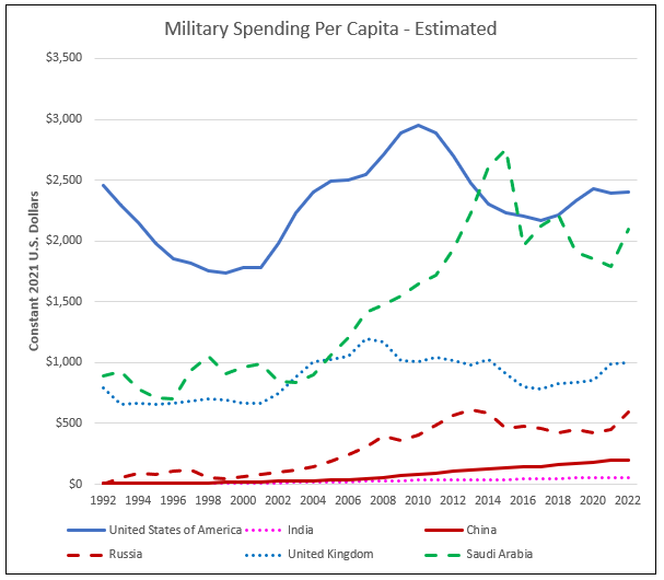
While not included in the Fed piece, controlling for population size would have been another presentation option. The SIPRI dataset includes per capita spending figures for all but the United States, and perhaps that omission is why the Fed authors did not include such a view in their piece. However, by combining the military spending figures from SIPRI with readily available population figures from Macrotrends (itself sourcing from UN data), a reasonable estimate for the United States’ per capita military spending can be calculated (see below). It is true that there could be methodological inconsistencies in this approach given that the per capita SIPRI data does not cite the specific source used for the population denominator, but the difference would likely be minimal and could be disclosed/footnoted. On a per capita basis you can see that the United States and Saudi Arabia are spending substantially more than the rest of the cohort.
To be clear, this commentary is not meant to make political pronouncements on the spending preferences of the countries discussed. Nor is it to claim malicious intent by the authors (although I can absolutely see why everyone in the quote tweets thought so). All of the data discussed in the text of the article was represented accurately. The key takeaway should be how easy it is to damage the credibility of your presentation or argument with poorly thought out visuals.
Bad presentation will always undermine otherwise competent work.
In this specific case the St. Louis Fed did ultimately acknowledge the criticism on Twitter, but the chart remains unchanged in the actual piece as of this writing.
Back to Basics
Returning to more business-centric framing, anyone who has sat through a budget meeting has seen A LOT of charts and graphs. The differentiator between success and failure in business very often hinges on making well-informed decisions, with visuals being a crucial part in that process. But what actually makes for an effective visual? Well… it depends. As previously mentioned, part of professional development is learning what method is best for communicating a given piece of information. Let’s use some made up numbers for a made up company, FakeCo, to use for hypothetical meeting materials.
Your initial questions should always be:
- What is the purpose of the meeting?
- Who is the audience?
- How much time do I have to present?
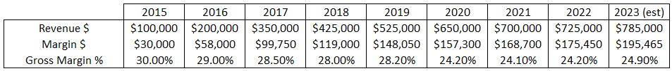
More than anything else, time might actually be the most consequential factor in deciding what makes it into your primary materials and what gets relegated to the appendix that your colleagues swear they’ll read later... The difference between being the sole presenter for 30 minutes, or just 5 minutes in a long slate of presenters is substantial. We’ll assume this meeting is to discuss FakeCo’s forecasted margin and that we only have a few minutes. An introductory chart could look something like this:
Given that the X-axis is showing back to the start of FakeCo, the Y-axis should definitely start at zero. Even though we are showing two different metrics, since they are both in dollars and not wildly different in scale, we probably don’t need to use a secondary axis. While very basic, this graph clearly communicates that revenue and margin dollars have been increasing every year. Growth does appear to be slowing however, and that rate is not easy to interpret with this current view.
Always anticipate follow-up questions you might receive and plan accordingly.
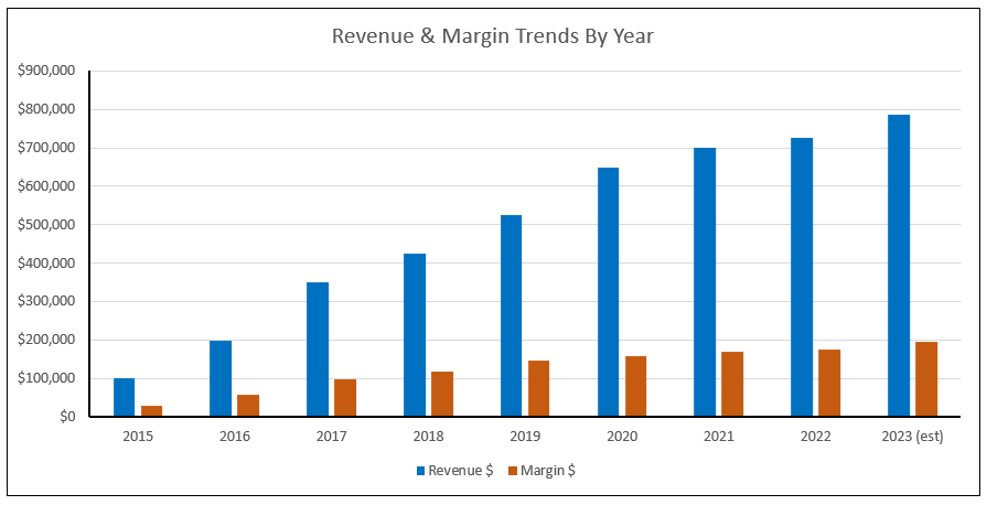
How should we communicate the changes in growth rate over time? Unlike what the St. Louis Fed authors did, a better use of the secondary Y-axis is to show volume and rate information in a single chart. Below is a combo graph that lets us show dollars and growth rate for revenue and margin. Since the different elements are all clearly labelled, the chances of confusion should be limited, particularly if this is a format your audience has frequent exposure to. Technically all 4 of the elements could be shown in bar or line graph form, but by splitting the metrics into distinct visual styles, it increases readability.
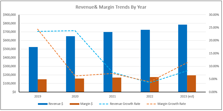
Another factor to consider is how much data to include. The chart above shows nine years worth of results, but if our meeting is focusing on 2023 margin expectations, does going back to 2015 make sense? If this were part of a more holistic review of the company’s historical performance then that older data might be relevant, but likely not in this context. How should you decide then? Maybe we know that the company suffered impacts from the pandemic that are still being felt today. If that is the case, starting our chart in 2019 as shown below, is defensible. In general the only way we can understand current performance is by relating it to what has happened in the past.
What would your audience likely derive from this chart? Seasoned eyes would surely notice that despite continued but slowing revenue growth during this period, the gap in revenue and margin growth rates in 2020 has to be driven by a drop in gross margin rate. We’ll think about how to show that after first discussing…
Minding the Y-Axis
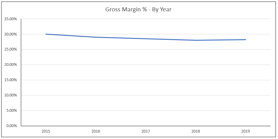
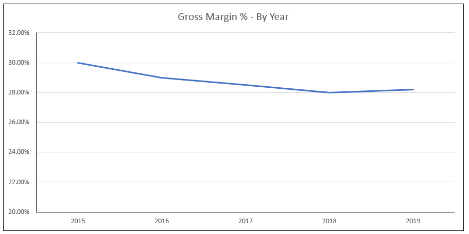
When creating charts, Excel automatically adjusts the Y-axis to a range that it thinks makes sense for the highest and lowest values in the selection. Oftentimes it will default to a minimum value of zero. It is possible however to adjust Excel’s default range selection in order to achieve a different “zoom” on the Y-axis. These decisions are where the aforementioned “fine line” of data presentation comes into play. Whether it makes sense to do this is highly dependent on both the specific data point and timeframe being analyzed. As an example, here are three graphs that show the same exact 2015 thru 2019 margin rate values for FakeCo, but with different Y-axis settings:
- Y-axis minimum manually set to zero, automatic/default maximum: Visually suggests margin rate has decreased over time, but only slightly.
- Y-axis minimum manually set to 20%, automatic/default maximum: Margin rate decline is more clear visually, but does not necessarily signal cause for alarm.
- Y-axis min/max set to Excel’s automatic default. Visually the steepest decline of the three options. Without additional commentary the most likely to generate alarm even though the percentage decline in rate from 2015 to 2019 is only 6%.
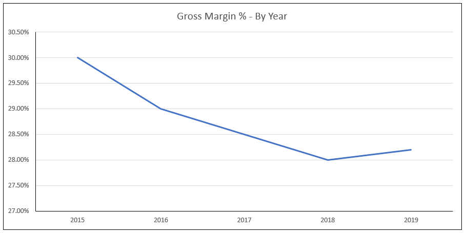
As mentioned at the start, there is no right answer when deciding how to present a given data point. In general, none of these numbers should or would be presented in a vacuum. The goal should be to provide the audience with the information and context they need to make future decisions. If I had to include one of those three examples, I would put it in the appendix and use Figure 2.
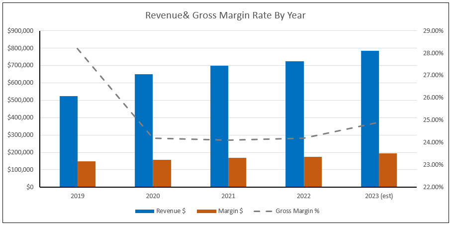
Getting back to our 2019 to 2023 time period, the combo chart below would likely provide the best combination of data points to explain what has happened to FakeCo since 2019 as well as expectations for 2023. It also allows you to convey a lot of information in a single visual without overwhelming the audience. Here are some theoretical talking points:
- “In order to meet the challenges of the pandemic, FakeCo had to adjust its pricing strategy in order to survive.”
- “Our customers responded to our pricing changes favorably , and as you can see, despite reducing our gross margins by ~14% in 2020, we were still able to grow revenue year-over-year.”
- “Revenue growth has remained slow but consistent post-pandemic, and for 2023 we are expecting gross margin improvement of 70bps driven by our new product launches.”
If you still had time, additional charts/slides could cover topics like margin contribution by product, what is changing in 2023 to drive the forecasted improvement, and potential risks to that forecast.
Concluding Thoughts
Everything that has been discussed here is part of the broader language of business and finance. Learning how to synthesize financial data and visuals into a compelling narrative is a crucial skill in the development of any finance or accounting professional. There are countless analysts who may grasp the mathematical fundamentals but struggle with how best to communicate actual insights. In order to advance to higher levels in your career, grasping the concepts discussed here are table stakes. Even the increased adoption of AI tools cannot offset poor fundamentals.
Let me know in the comments if you found value in this discussion and any of your own data presentation tips.


